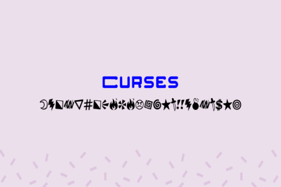
Curses Font Review: A Playful Typeface for Creative Branding
I was staring at a blank Canva canvas, trying to design a landing page for a new digital product launch. The hero section felt flat. It had the right copy, the right images, but it lacked that spark of personality that makes a visitor stop scrolling. That’s when I decided to test-drive Curses, a dingbats typeface created by Vic Fieger. As a web designer who spends half my day worrying about line-heights and the other half chasing aesthetic vibes, I wanted to see if this creative font could actually hold its own in a modern digital layout.
Curses is not your standard workhorse sans serif. It is an interesting dingbats font that has the role to enhance your craft with its doodles and funny icons. While it might sound like something reserved for scrapbooking or party invitations, I found that when used with restraint, it brings a distinct, playful energy to web design. Here is how Curses performed when I integrated it into real website mockups, from boutique online stores to personal portfolio sites.
First Impressions: Visual Personality and Mood
The first thing you notice about Curses is its hand-drawn, sketchy quality. It feels informal, approachable, and slightly chaotic in the best possible way. In a sea of clean, geometric sans serifs like Inter or Roboto, Curses stands out because it feels human. It doesn’t try to be perfect; it tries to be fun.
This visual personality makes it an excellent choice for brands that want to communicate creativity, humor, or casual professionalism. I tested it on a homepage for a fictional art supply shop. When placed over a textured background image, the doodle-like glyphs added a layer of depth without cluttering the interface. It signals to the user immediately that this brand is different—it’s not corporate, it’s crafty. This aligns perfectly with the modern typography trend where designers are moving away from sterile aesthetics toward more expressive, editorial design styles.
However, it is important to remember that Curses is a display font. Its strength lies in its decorative nature. It is not designed for long paragraphs or dense text blocks. Instead, it shines as a headline, a tagline, or a unique accent element. Think of it as the visual equivalent of wearing a statement accessory—it draws the eye, but it shouldn’t do all the heavy lifting.
Testing Curses in Real Web Layouts
To truly understand how Curses works in a responsive environment, I applied it to several common web design components. Here is what I learned about its performance across different contexts.
Hero Sections and Headlines
This is where Curses truly excels. In a hero section, you have a few seconds to grab attention. Using Curses for the main H1 title gave the page an immediate sense of character. For example, on a course sales page for a creative workshop, the headline “Learn to Draw with Confidence” looked significantly more inviting in Curses than in a standard bold sans serif. The quirky icons embedded within the letters (like little stars, swirls, or abstract shapes) caught the eye and encouraged users to read further. Just ensure the background contrast is high enough so the intricate details of the font don’t get lost.
Landing Page Banners and Call-to-Actions
I experimented with using Curses for banner text on a boutique online store. It worked beautifully for short phrases like “Summer Sale” or “New Arrivals.” However, I ran into issues when trying to use it for button text. Because the letters are stylized with extra flourishes, small button labels became difficult to read quickly. For call-to-action areas, it is better to stick to a clean, legible sans serif font for the button itself, perhaps using Curses only for the surrounding promotional text above or below the button.
Blog Graphics and Social Media Previews
One of the most practical uses I found for Curses was in creating custom blog graphics and social media assets. Since these images are often viewed at larger sizes on desktop feeds, the detailed doodles in the font render clearly. I used it to create headers for blog posts about DIY projects and lifestyle tips. It helped establish a consistent brand identity across platforms, making the content feel cohesive and professionally curated.
Font Pairing for Digital Identity
No typeface exists in isolation, and Curses is no exception. To balance its playful chaos, I paired it with simple, neutral fonts. The golden rule here is contrast. If your headline is loud and decorative, your body copy should be quiet and readable.
- Pairing with Sans Serif: For a modern, tech-forward look, I paired Curses with a clean sans serif font like Open Sans or Lato for body text. This combination works well for startups or creative agencies that want to appear innovative but trustworthy.
- Pairing with Serif: For a more editorial or literary feel, such as a book review site or a personal journal, pairing Curses with a classic serif font like Merriweather adds a touch of sophistication. The contrast between the handwritten style of Curses and the structured elegance of the serif creates a visually interesting hierarchy.
Avoid pairing Curses with other script fonts or highly decorative display fonts. Doing so creates visual noise and makes the content hard to scan. The goal is to let Curses be the star while the supporting typography does the work of delivering information clearly.
Readability and Accessibility Considerations
While Curses is charming, web designers must always prioritize accessibility. The decorative elements in the letters can sometimes reduce legibility, especially on smaller screens or for users with visual impairments. I noticed that when scaled down to mobile viewports, some of the finer details in the glyphs blurred together.
To mitigate this, I increased the font size and weight when using Curses on mobile devices. I also avoided using it for navigation menus, form labels, or any text that requires quick scanning. These elements demand clarity above all else. Reserve Curses for static text that users choose to engage with, rather than functional UI elements.
Additionally, check the color contrast carefully. Dark backgrounds with light Curses text can sometimes lose definition due to the complex shapes of the letters. Lighter, simpler backgrounds tend to showcase the font’s personality better. Always test your designs in different lighting conditions and on various devices to ensure the font remains readable.
Practical Tips for Implementation
If you decide to incorporate Curses into your web projects, keep these practical tips in mind to maximize its impact:
- Use Sparingly: Treat Curses as a spice, not the main course. Use it for headlines, pull quotes, or small decorative accents. Overusing it will fatigue the reader.
- Check File Formats: Ensure you have the correct file formats for web use. While Curses is primarily a desktop font, converting it to webfont formats (WOFF/WOFF2) can help maintain quality across browsers. However, since it is a dingbats font, consider exporting key words as SVGs or PNGs if the webfont rendering looks inconsistent.
- Verify Licensing: Before using Curses in client projects or commercial websites, double-check the commercial font licensing. Even though it is categorized under Freebies, usage rights can vary. Ensure you are compliant with Vic Fieger’s terms, especially if you are selling products or services that feature the font prominently.
- Test Responsiveness: Always preview your designs on mobile, tablet, and desktop. Adjust line heights and letter spacing to ensure the decorative elements do not overlap awkwardly on smaller screens.
Final Verdict
Curses is a versatile and delightful addition to any designer’s toolkit. It brings a sense of whimsy and authenticity that is often missing in generic template designs. By using it strategically alongside clean, functional typography, you can create web experiences that feel both professional and personable. Whether you are designing a portfolio, a landing page, or a brand kit, Curses offers a unique way to inject personality into your digital presence. Just remember to respect its limitations, use it for display purposes, and always keep the user experience at the forefront of your design decisions.